As you may know, GA4 is all about personalization – and that includes the design of your reports. With customizable dimensions, metrics, and visualizations, there are endless possibilities to create reports that fit your unique needs. But why stop there? With a few simple tricks, you can also create impressive and visually stunning reports that will blow your boss's mind. And you are the boss here.
In the last episode of our series, we showed you how to create your own report and assign it to a collection. Today, however, we're going to focus on a small, but very important issue – customizing the design to our needs. Without wasting too much time...
...let's get started!
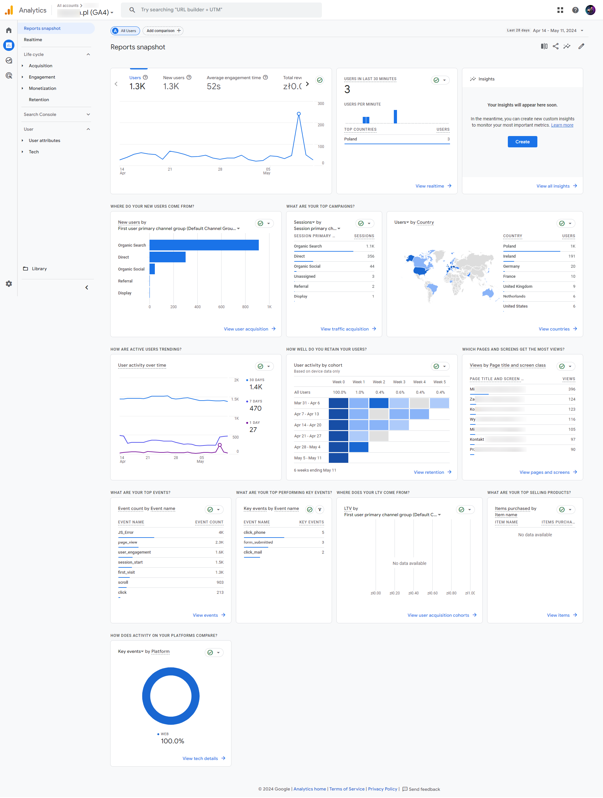
The appearance of the standard interface in GA4 is as follows:

And when we look at our reports, it's not very encouraging, is it?
.png)
What if we told you that this look can be customized to tailor it even more for our project? Take a look at the example below:
.png)
That's right! In GA4we can add icons to our collections and reports, and rename them – all to make the interface even more tailored to our needs.
How to add icons to collections and reports?
1. First, find the icon you would like to add (type “icons to copy and paste” in Google search, for example).
2. Copy the icon.
3. Create your own collection or report (here is a link to our article).
4. As you add the name of the collection or report – just paste your icon and name it.
.png)
.png)
And do the same with Reports when creating them.
Voilà!
.avif)


